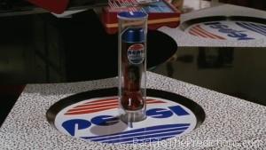
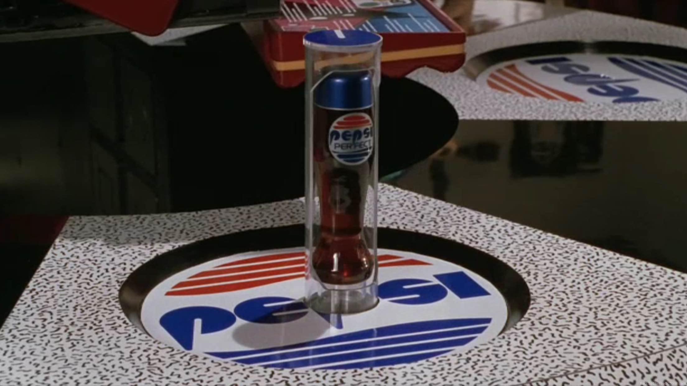
 Pepsi logos are seen on Pepsi bottles, in the Cafe 80’s, and on walls in Hill Valley of 2015. However, it’s not the same Pepsi logo that Marty was used to from 1985.
The Pepsi logo in use when Marty left 1985 was introduced in 1973. It had “PEPSI” written in blue in the middle, a red wave at the top, and a blue wave at the bottom.
In 1991, the logo was changed to put “PEPSI” in italics. The blue and red parts of the circle were put closer together to form a sideways “ying/yang” sort of design. A red stripe was to the left of this and underneath the Pepsi name.
In 1997, there was a modifications to this design to make the logo appear to have more depth. 2003 saw a minor change to the font and made the circle appear to be more 3D.
Pepsi introduced a new logo in 2008 which changes the swirl in the circle. Different styles of Pepsi would have a different size white stripe in the swirl. However, as of 2010, all styles of Pepsi started using the same swirl.
The Pepsi and Pepsi Perfect logos seen in Back to the Future Part II are clearly based on the 1973 logo. The font has changed and the red and blue waves have some white horizontal stripes added.
Back to the Future Part II may not have predicted Pepsi’s 2015 logo correctly, but the movie did successfully predict that Pepsi would change its logo and it would still use some form of the “swirl” in that logo.
Pepsi still has until October to do a Back to the Future Part II tribute and give us a limited edition “Pepsi Perfect” with this logo.
Prediction Accuracy: Success
